Digital Designer
Build Buddy Website
Designing for Australia’s Ultimate Home Building Companion
MY ROLE
Graphic and Website Designer, CMS Developer
MY RESPONSIBILITY
- Creating graphic assets
- Building the Website using Duda CMS Platform
- Maintain a good UX flow throughout the website
TOOLS
Figma, Adobe Illustrator, Duda CMS, Go High Level
PROJECT OVERVIEW
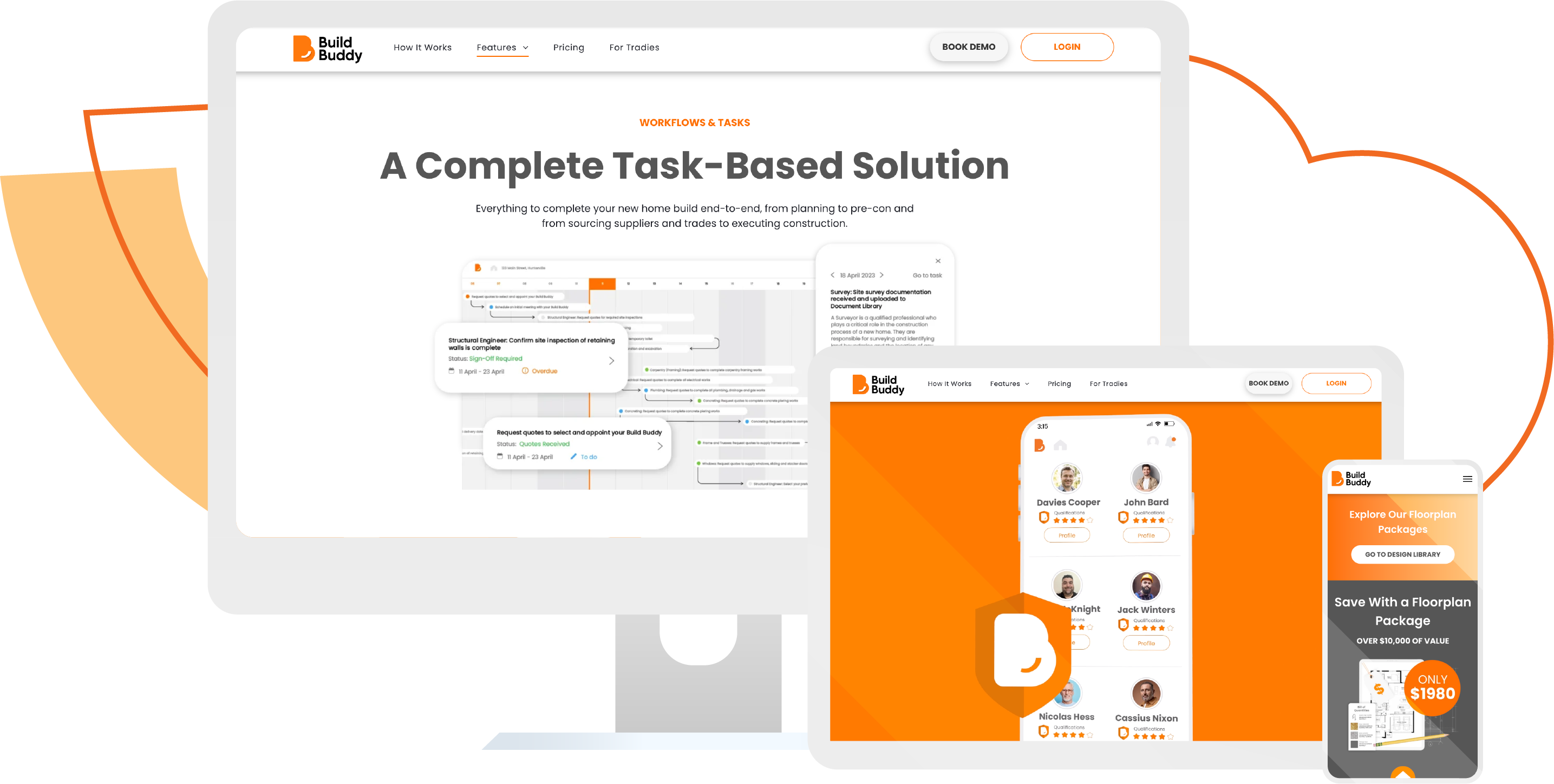
Build Buddy is an all-in-one platform for the home building industry that connects homeowners with contractors and trades. Build Buddy Website needs a massive redesign from how it used to look like in terms of User Interface Design. Working alongside a creative director and the marketing team, I took on the challenge and created an engaging and well-built website that reflects the Build Buddy brand across every pages thoroughly. I'm also responsible in creating newer pages as the Build Buddy App matures and have more features included. The website is currently live and available for the public.
The Problem to Solve
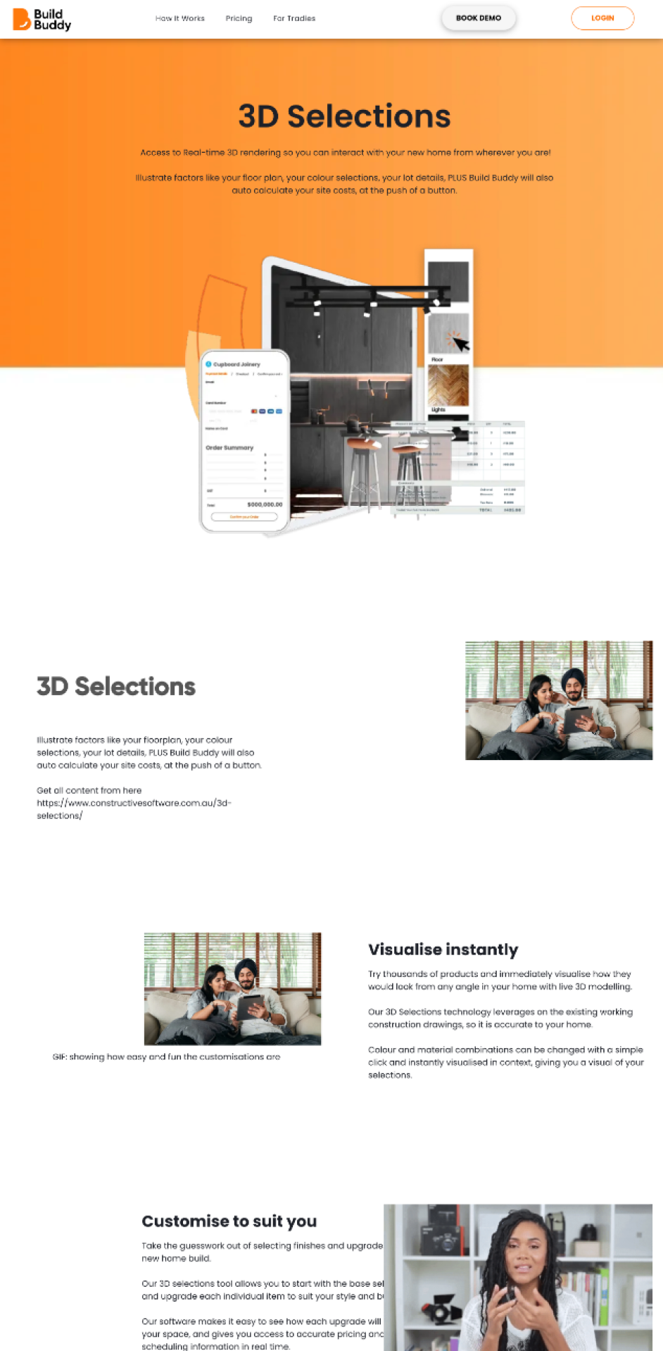
Upon joining the project, I found the Build Buddy website in the midst of significant development, with much of its content yet to be finalised.
Only a few pages were set up, while the majority remained either blank or filled with placeholder content.
The site faced notable UX challenges, impeding engagement and product visibility. Pages lacked essential UX principles, resulting in a frustrating experience for visitors due to subpar content quality, limited imagery, and inadequate layout, diminishing overall appeal. Additionally, the site was not optimised for mobile or tablet devices, alienating potential customers.
In collaboration with the strategy team and creative director, I was tasked with crafting content to populate the pages, redesign the layout and ensure a smooth UX flow throughout the website, utilising the Duda website builder.
Differentiating Build Buddy and Build Buddy Pro Website
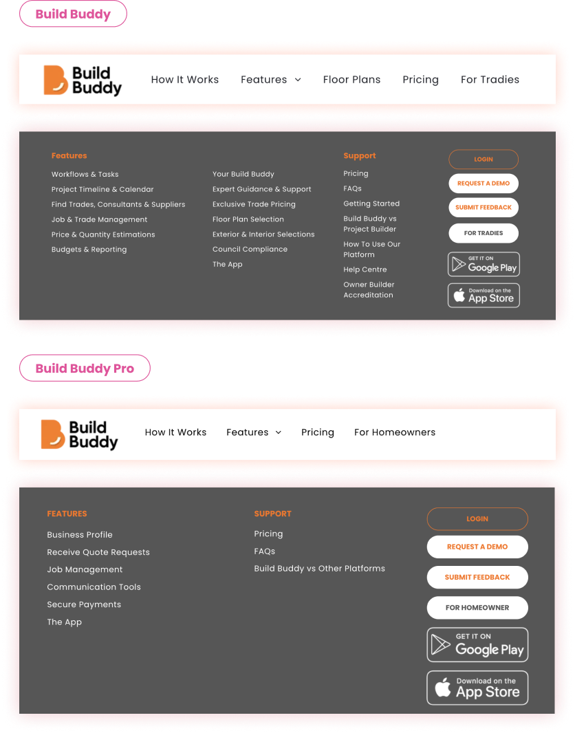
Like Uber and Airbnb, Build Buddy caters to both tradespeople and homeowners, necessitating distinct user interfaces: Build Buddy for homeowners and Build Buddy Pro for tradespeople.
Following competitor analysis and feedback from stakeholders, we opted to differentiate the two websites primarily through their header and footer designs, while retaining the same logo based on Build Buddy's business decision.
I'm proud to have upheld consistent branding while facilitating seamless user switching between the two websites.
The Journey: An Iterative Design Process
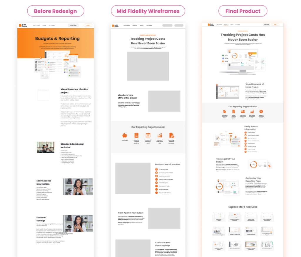
Numerous iterations and approvals were essential to achieve the current website design. Every web page demanded its unique brief and underwent extensive iterations. I use low-fidelity wireframes to determine the overall layout of the website page that’s a bit more complex such as the Floorplan product page.
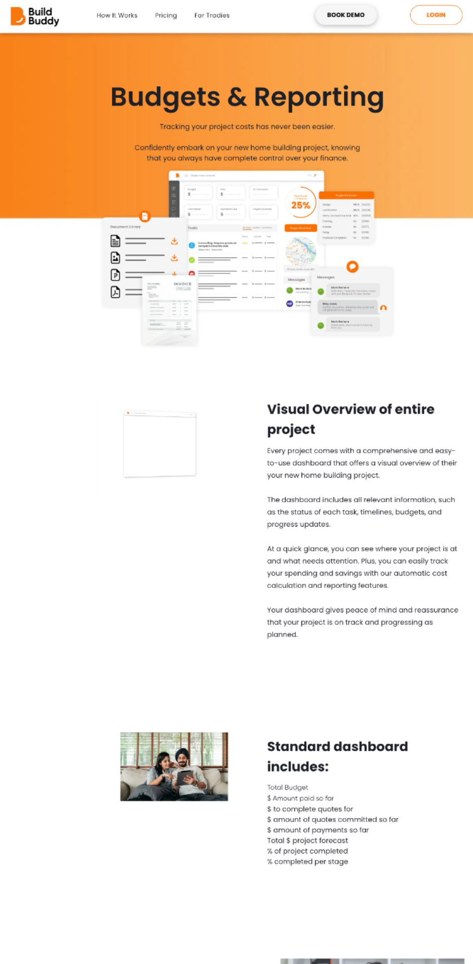
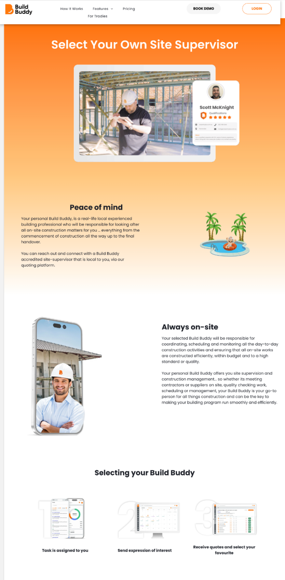
While designing for informational pages such as the features of the product, I use a more simple layout. I started designing informational pages with mid-fidelity wireframes that uses a combination of existing components on the website such as the header, footer, and CTA sections. This makes the process much faster and more efficient.
The Challenges
Ongoing Development of Build Buddy App
The primary challenge for this project was visualising the unfinalised Build Buddy App within the website. To tackle this, I created anticipatory screens, drawing inspiration from Klaviyo.
Technical Limitations within Duda CMS Platform
Designing certain pages for Build Buddy on Duda had limitations. Certain elements were missing, so we had to employ custom coding and integrate them into a third-party software.
Ensuring Website is fully responsive
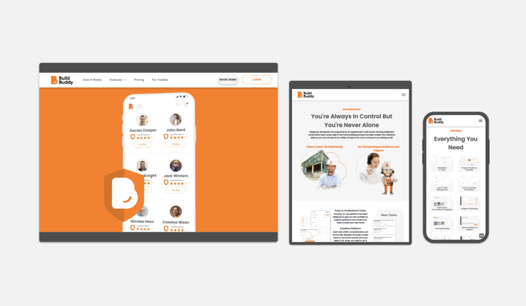
There are a lot of pages within the Build Buddy website and each page contain different types of information. This means that we would need to consider how the pages would look like on mobile and tablet as well.
Responsive Website Design
* This shows a screenshot of the website development on Duda to check for responsiveness. Note that the website is constantly getting improvements and updates as the Build Buddy matures. Thus, future designs might look a little different.
Let's Work Together!
Don't hesitate to contact me if you have any inquires! I'm best reached through Linked In or email.